Monday, November 16, 2009

Light Sketch 1

Patio door in my apartment.


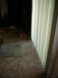
September 10, 2009
3:00 pm

distinct shadows on the floor
bright
clearly see each panel on the blinds

_____________________________________


September 10, 2009
4:00 pm
blinds have a more yellow tint
the whole area is darker
shadows aren't as distinct on the floor


_____________________________________


September 10, 2009
4:40 pm
shadows on the floor shifted
blinds are brighter


_____________________________________
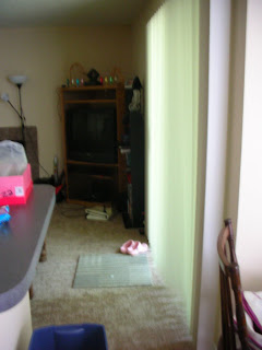


September 17, 2009
4:00 pm

much brighter than 4pm on the 10th
shadow appears half the size of before
very bright edge on blinds


_____________________________________


September 28, 2009
4:30 pm
same bright edge on blinds, but also on the bottom now
distinct shadow lines on floor
brighter


_____________________________________


September 30, 2009
1:30 pm
concentrated light on edge of blinds
distinct shadow at corner of blinds


_____________________________________


October 7, 2009
3:00 pm

minimal shadows on the ground
light is evenly distributed throughout the space
blinds are not very bright
no hard shadows on the floor




Light Sketch 3

My Materials: (left to right) Yellow, Red, Blue, Violet


1. Fluorescent
Location: Light above kitchen sink
Task Lighting
F15 T8 3000K 15W
Fluorescent Tube; open, no covering
During observations main overhead kitchen light is off, only fluorescent light is on


Red appears a little darker, not as bright
Violet and
blue look the same
Yellow has a green tint


2. Incandescent
5 "Night Light" bulbs
lighting over dining tables
not a formal area
used for eating and other daily tasks
enclosed in hanging glass panels
all colors look normal except blue appears
a little gray and not as vibrant blue.


3. Fluorescent
lamp in living room
not direct lighting; lights a space
has a yellow glow
enclosed by a beige lamp shade
bulb, self ballasted lamp
13W 120V
CF13EL / MINISPIRAL


blue was a little pale
yellow appeared green
red and violet look normal

Light Sketch 2

Location: Bar at Ham's Lakeside

Most of the luminaires are located in the ceiling, but the majority of the lighting comes through the windows. During the day the lights are on but not really used. At night, the windows are not dependent for lighting and the luminaries provide all visibility. The room holds seven windows and one exterior door. There are a few wall sconces and all are directed upwards. There is no pattern of lighting in this room but there are a few focal points. The main lighting at night is track lighting of spotlights. They are directed towards the tables but put out dim lighting and not necessarily direct focal points. The wall sconces help create the “bar mood.” There are also rotating disc lights that advertise different beers. These lights are obviously not intended for lighting a space, but merely for decoration and advertisement. Also contributing in the least,are eight televisions and a few advertising neon string signs. I don’t really see any problems that need to be addressed. There is one glare factor that happens on a hanging plastic banner advertising a beer. The light is directly in front of it so it produces a slight glare. The banner was obviously placed long after the lighting was installed. Behind the bar is minimal lighting.They only exist in the cubbies housing the glassware. The lighting provides numerous shadows.Overall, the space has a relaxed setting. The room is not too large so it’s intimate, but its also not so small to be crowded.


Pictures from sketchbook
Immediately below: Rotating disc light advertising beer

Above: Track Lighting
Above and to the right: Spot lighting
Above: Two separate wall sconces

The one on the left is similar to a miniature lamp that produces a glow.
The one on the right directs light upward and is open.


Wednesday, September 2, 2009

Lighting Summary - Readings

Summary of the 3 Readings:

Light Revealing Experience
Lights at Night are Linked to Breast Cancer
The Claim: Daylight Savings Time Can Affect Your Health

Studies were done comparing light to sleep disorders during daylight savings time as well as breast cancer. I was not aware of light being so effective to human health. I know how smoking is linked to lung cancer, but I had no idea that lighting was linked to a higher risk of breast cancer. Scientists have proven that rats kept in cages with the lights kept on for most of the night have higher cancer rates than those left in the dark. (“Lights At Night” – pg. 1) Breast cancer rates are also sixty percent higher among people who work at night such as flight attendants and nurses. The night shift has been placed in the same category for a risk of toxic chemicals. (Lights At Night” – pg. 1) The body produces a hormone called melatonin primarily at night. This naturally occurring hormone promotes sleep and is increased by darkness. (“Implications” – pg. 1) Studies have shown that rats who have a shot of this hormone have normal instead of increased rates of cancer. The neighborhoods with the most nocturnal lighting have been proven to have a thirty-seven percent higher rate of cancer. These studies were done before the switch to fluorescent bulbs started being pushed. (“Lights At Night” – pg. 2) The fluorescent bulbs save energy but suppress the production of the melatonin hormone.

Scientists have also tried to make a connection between health issues and the change of time for daylights saving time. They discovered that even after weeks of the time changing, the circadian rhythm in ones body does not adjust. (“The Claim”) There have been suggested links to sleep disorders, suicides, and accidents through daylight saving time. Scientists also say that more study is needed for this to be a proven fact. (“The Claim) Studies showed that people’s peak activity levels were higher in the spring with the daylight savings time in effect, rather than normal in the autumn. Mainly daylight saving time is associated with sleep disorders, which is unhealthy for the human body.

As a designer these articles make me look at lighting in a whole new perspective. I will research these studies more closely and use precautions in adding lighting to my designs. I will take into consideration what shifts will be worked in the spaces if the area is designed for work. I will design my space around the sunlight paying close attention to where it rises and where it sets for the area. Also, how the light will fall in the building through windows and doors. I do not feel as though the bedrooms should be placed on the side of the house where the sun rises or sets. This way the house is versatile for a day worker or a nighttime worker. Light will shine in through all windows but the lighting does not have to be prominent in the bedrooms.

Sunday, August 30, 2009

Perception and Psychology Lighting Evaluation


Room 302B is used as a studio classroom and as a work space for students. It is a large room accommodating approximately 20 L-shaped workspaces. It is very public in scale, however it does provide some sense of boundary with wooden and metal displays which partially block the view from the hallway on the east side. The colors in the space are mostly neutral, including primarily white walls, wooden ceiling and a gray concrete floor. The only color is orange on the walls below 3 feet, colored plastic chairs and artwork high on the two-story wall. The one-story west wall is mostly windows fitted with mini-blinds. North and south walls move from one-story to two-story at about a 30 degree angle, open at the high ends to allow views of the upper floor. The east wall starts at 8 feet above the floor and runs to the top of the next floor. The space is quite symmetrical. There are 15 pendant light with fluorescent bulbs. At the time of our analysis, it was cloudy and early afternoon. Sunlight streamed in from the windows. The light was diffused, there were only soft shadows. The lighting good for task, except for glare on computers

Our impressions were that the room was bright, open, good for community and keeps us alert. For some purposes the room would make one feel exposed, but otherwise it was a comfortable place.


We averaged out our observations...

visual clarity

distinct vs. vague = 2

faces clear vs. faces obscure= 3

bright vs. dim = 2

spaciousness

large vs. small= 2

spacious vs. cramped = 2

wide vs. narrow= 2

long vs. short = 3

horizontal vs. vertical = 4.5

color tone

colorful vs. colorless = 3

glare

glare vs. no glare = 2

public vs. private space

public vs. private = 2.5

relaxing vs. tense space

relaxed vs. tense = 2

like-dislike

like vs. dislike = 3

satisfying vs. frustrating = 2

cheerful vs. somber = 2

interesting vs. monotonous = 2

beautiful vs. ugly = 2

pleasantness

pleasant vs. unpleasant = 3


Group Members:

Kristina Stout

Kara Wolfe

Susan Webster

Pam Cooke

Thursday, August 27, 2009

Interior Lighting Design

I like how the designer used lighting within the design. The light isn't necessarily used to light up a space, but more for a warm glow.


pacman_remake_paris_2008.jpg

I like how the use of light is portrayed in a life size stationary pac-man game on the wall. It provides lighting along with decoration.


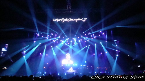
This is obviously for a concert, it seems like it would be a bit overwhelming and distracting; but I like it. Lights in all different directions seems crazy but neat at the same time.


Lightning is something that has always frightened me, but to look at pictures of it has always been intriguing. It branches out in so many ways and its something that cannot be aesthetically reproduced.


Weekly Light Picks